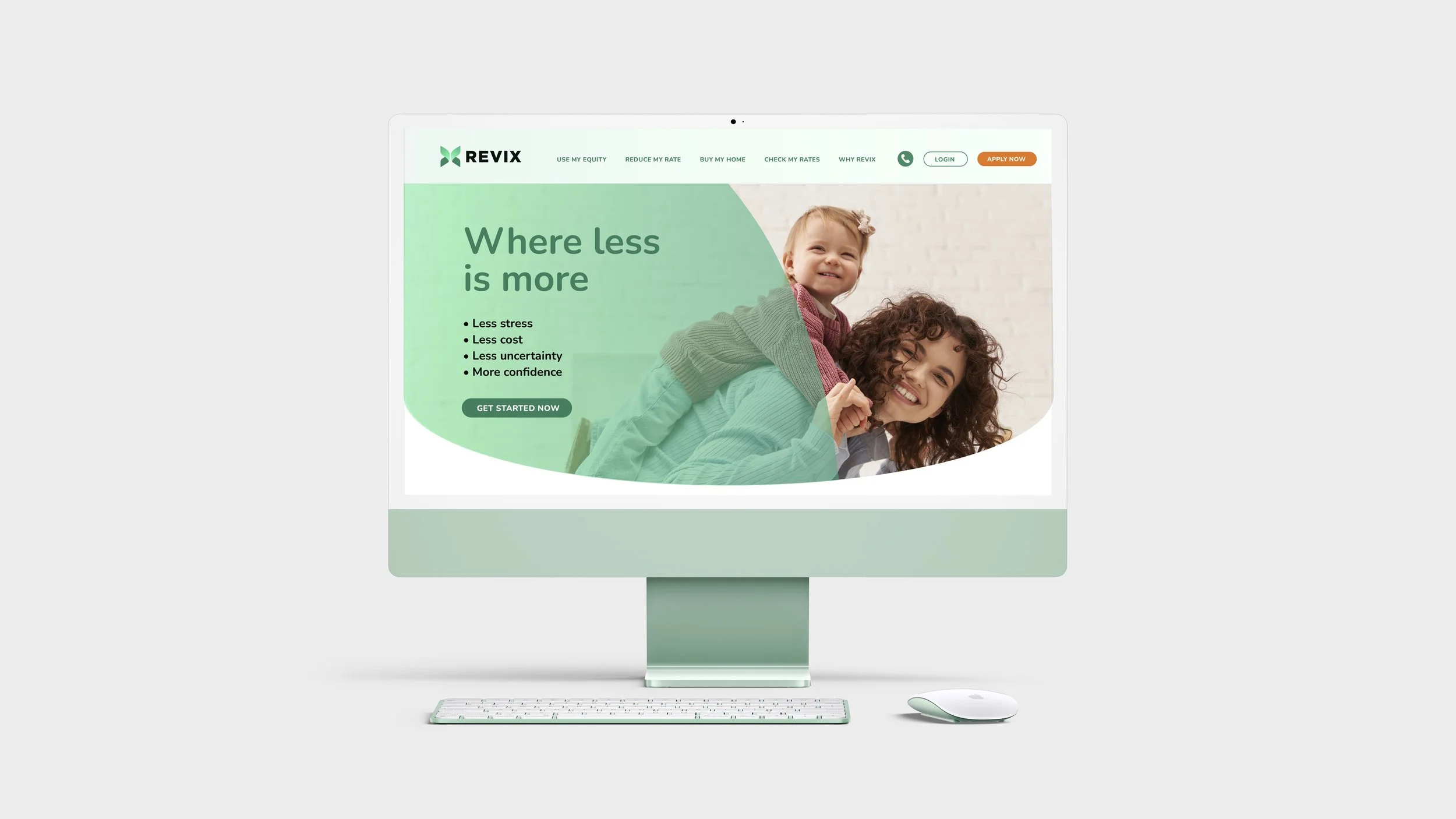
Revix
I partnered with LoanFirm to build an entirely new brand, the result was Revix.
The name draws inspiration from revving an engine and revolutionizing mortgages, with the X signaling performance and forward momentum.
I also introduced the tagline “Where less is more,” capturing Revix’s belief that simpler processes, fewer fees, and greater transparency lead to better outcomes. Following the rename and tagline, I led the creation of the brand messaging and visual identity system, positioning Revix to stand out with millennials navigating a rapidly changing home-ownership market.
Brand Naming
Messaging + Positioning
Logo Design Direction
Web Design Direction


